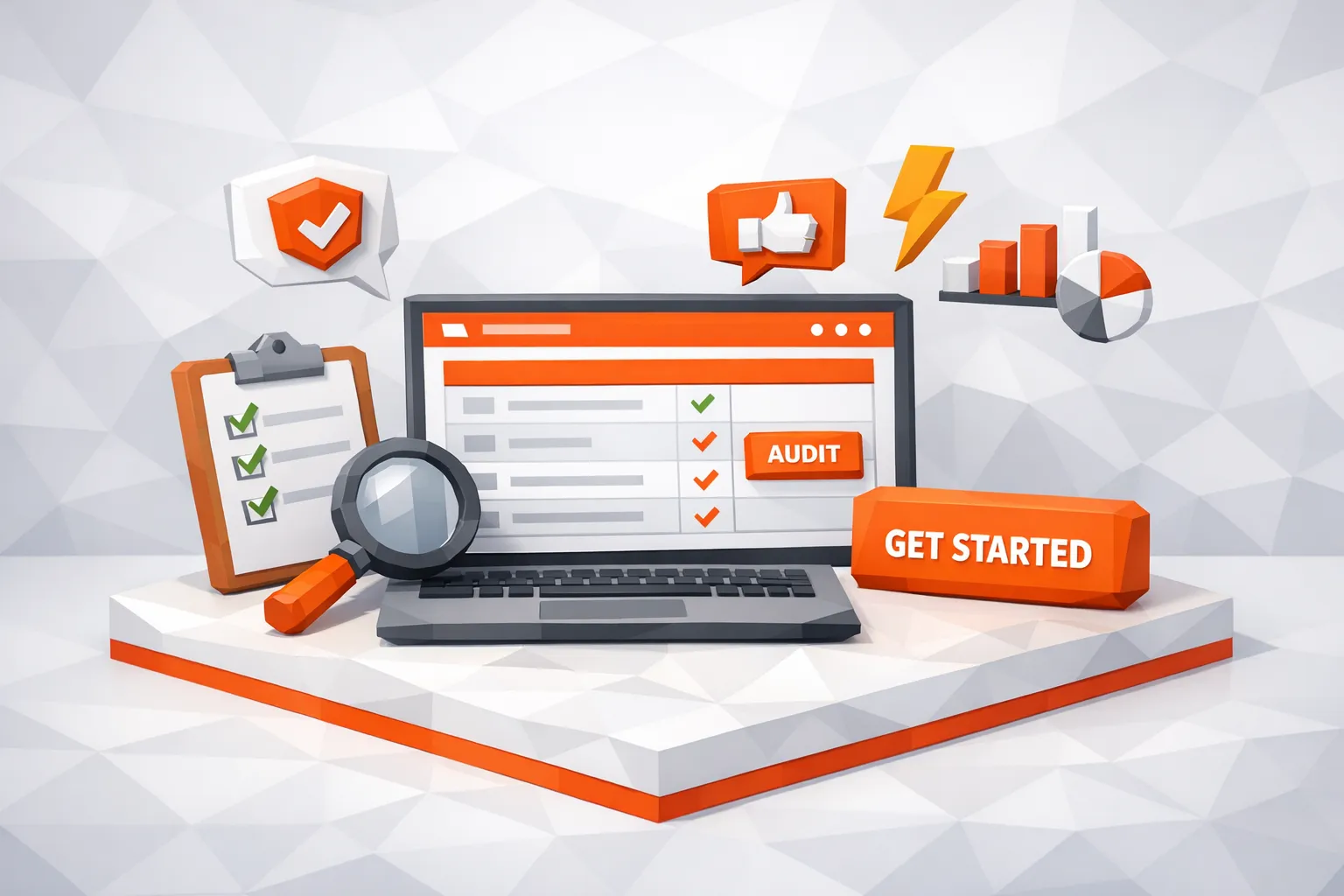
AI Website Checklist: What Your Site Needs to Convert
A practical, founder-friendly checklist to audit AI landing pages for measurable conversions—message, mechanics, and measurement.
Most “AI websites” fail to convert for a simple reason: they look like a model demo, not a business. Visitors land, they do not immediately understand who it is for, what outcome they get, why they should trust it, and what to do next.
This checklist is built for founders and growth teams who want measurable conversion, not vibes. Use it to audit your homepage and your main landing page in one sitting, then prioritize fixes that move signups, demos, or purchases.
The 3-layer conversion model (use this to prioritize)
A converting site needs three layers working together:
Message: Clear promise, clear audience, clear differentiation.
Mechanics: Fast, usable, low-friction conversion path.
Measurement: You can attribute conversions to a source, page, and intent.
If you are driving traffic from high-intent sources (like Reddit threads, communities, newsletters, or AI answer engines), weak mechanics and missing measurement quietly erase the value of that intent.
AI website checklist (quick audit table)
Use this table as a one-page review, then go section by section for implementation details.
| Area | What “good” looks like | How to verify in 5 minutes | Primary metric |
|---|---|---|---|
| Above-the-fold positioning | ICP + outcome + how it works, in one screen | Show the page to someone, ask “what is this?” | Bounce rate, scroll depth |
| Single primary CTA | One obvious next step, repeated consistently | Count CTAs above the fold | CTA click rate |
| Proof | Specific evidence, not adjectives | Look for numbers, names, artifacts | Assisted conversions |
| AI clarity | What the AI does, does not do, and why it is reliable | Find a “How it works” section with constraints | Trial-to-paid, demo show rate |
| Speed + mobile UX | Loads fast on real phones, stable layout | Run PageSpeed Insights | Conversion rate, CWV |
| Frictionless path | Few steps, minimal fields, clear expectations | Time-to-CTA completion | Form completion rate |
| Pricing and packaging | Visitors can self-qualify quickly | Can a buyer tell if it fits budget? | Qualified leads rate |
| Objection handling | Top 5 objections addressed on-page | Scan for “Who it’s for / not for” | Lead quality, close rate |
| Analytics + attribution | UTMs, events, and outcomes are joined | Test a UTM link end-to-end | CAC by channel |
| Post-conversion | Thank-you page with next steps | Submit test lead, check flow | Activation rate |
1) Above-the-fold: your AI website must answer 4 questions instantly
Your first screen needs to be understandable in under 10 seconds. For AI products, this is harder because people default to skepticism (accuracy, privacy, effort to set up, unclear ROI).
Your hero section should explicitly cover:
Who it’s for (job title, team, or company type)
What outcome they get (a business result, not a feature)
How it works (one sentence, concrete, no jargon)
What to do next (one primary CTA)
Avoid vague claims like “AI-powered growth” or “automate everything.” They sound like placeholders.
A practical template that tends to convert:
Outcome + audience + mechanism
Example pattern (generic): “Book more qualified demos from high-intent conversations by monitoring X and responding with helpful, on-brand replies.”
If you want a reference for how people scan web pages, Nielsen Norman Group’s research on reading patterns and scanning behavior is a useful baseline (NN/g).
2) One primary CTA, one primary path
AI websites often include multiple “paths” because the product feels flexible. Flexibility kills conversion when it shows up as competing calls to action.
Pick one primary conversion event for the page:
Start free
Book a demo
Join waitlist
Get started
Then make everything else secondary.
What to check:
The primary CTA appears above the fold and repeats consistently.
Secondary CTAs are de-emphasized (link style, footer, or later in the page).
The CTA matches your sales motion. If your product needs qualification, “Book a demo” can outperform “Start free.” If your product is self-serve, “Start free” usually wins.
A simple mistake that costs conversions: sending every click to your homepage. High-intent visitors should land on a page that matches their intent and makes the next step obvious.
3) Proof that feels native to AI products (and reduces “tool risk”)
For AI, “trust” is not a vibe. It is reduced perceived risk.
Strong proof artifacts include:
Specific outcomes (time saved, leads sourced, hours reduced), with context
Screenshots or short clips (if you have them) embedded near the claim
Recognizable customer logos or named testimonials (only if accurate)
Technical proof when relevant (security notes, data handling summary)
Process proof (what happens step-by-step after signup)
If you do not have customer numbers yet, you can still provide proof through:
A transparent “How it works” breakdown
Example inputs and outputs (realistic, not cherry-picked, clearly labeled)
Public content that demonstrates expertise (operator-grade blog posts, playbooks, benchmarks)
For Redditor AI specifically, you can lean on operator content that demonstrates you understand the workflow end-to-end, for example the thread-to-demo process in your existing playbook (Reddit Lead Generation Playbook).
4) Explain your AI like a product, not magic
A converting AI website does not just say “AI does X.” It sets expectations and makes the system legible.
Include a section that answers:
Inputs: What does the AI read or monitor?
Decisions: What does it classify or prioritize?
Actions: What does it do automatically, and what stays manual?
Controls: What can the user approve, edit, limit, or exclude?
Failure modes: What can go wrong, and how do you mitigate it?
This is not about writing a compliance novel. It is about reducing uncertainty so a buyer can say, “I understand what will happen after I connect this.”
A good heuristic: if your buyer cannot describe your product to a colleague after reading your homepage, your site is under-explaining.
5) Speed and mobile UX are conversion features
AI buyers often come from mobile contexts (community links, social, search, AI answer engines). Slow pages silently burn high-intent clicks.
Google has long published that as page load time increases, the probability of bounce increases, especially on mobile (Think with Google).
Minimum checks:
Run your key landing pages through PageSpeed Insights.
Ensure text is readable without zoom.
Avoid layout shift (content jumping as it loads).
Keep the primary CTA visible and tappable.
If you only fix one technical thing this week, fix page speed on the page that receives your highest-intent traffic.
6) Reduce friction in the conversion step (forms, demos, trials)
Your conversion flow should feel proportional to the ask.
Common AI website friction mistakes:
Asking for too much information before value is delivered
Forcing account creation to view basic info (pricing, integrations, use cases)
Ambiguous next steps (“We will reach out soon”)
What to implement:
If it is a form, reduce fields to what you truly need.
If it is a demo, show what “a good demo” looks like (duration, agenda, who should attend).
If it is a trial, show time-to-first-value and a simple onboarding path.
A high-performing pattern for B2B is: short form, immediate confirmation, clear next step on the thank-you page (calendar link, setup checklist, or “watch this first”).
7) Pricing and packaging: help buyers self-qualify
Many AI websites hide pricing to avoid “scaring people off.” In practice, hidden pricing often scares off the wrong people and increases low-quality leads.
You have three workable options:
Transparent pricing: best for self-serve or clear packages.
Starting at pricing: good for variable usage-based products.
Qualification framing: if you must gate pricing, give ranges and clear buyer-fit criteria.
Whatever you choose, the page should answer:
Who is this for?
What does it replace (time, tools, headcount)?
What is the unit of value (per seat, per usage, per outcome)?
If you cannot share pricing publicly, share what drives pricing (volume, number of sources, number of workflows). That still helps buyers self-qualify.
8) Objection handling, explicitly, not buried
List the top objections you hear in sales calls, onboarding, and support, then resolve them on-page.
Common AI objections in 2026:
“Will it be accurate enough?”
“How much setup does this require?”
“Will this sound like AI?”
“What happens if it makes a mistake?”
“How do I measure ROI?”
Good objection handling sections look like:
“Who it’s for / not for”
“What it replaces”
“Controls and review”
“Measurement and attribution”
Keep it concrete. Add examples.
9) Match landing pages to intent (especially for community traffic)
Conversion rate depends heavily on message match.
If someone clicks from a high-intent context, such as a thread asking “What tool should I use for X?”, your landing page should mirror that intent:
Reflect the problem in the H1
Show the relevant use case first
Provide one “next step” aligned with that problem
This is where many AI websites waste paid and organic clicks. They send everyone to a generic homepage and hope the visitor self-navigates.
If you are doing Reddit-led acquisition, build “bridge pages” that are one screen, one promise, one CTA, and instrument them with UTMs. If you want a practical attribution approach, your existing guide is a solid reference (Reddit Lead Attribution).
10) Measurement: if you cannot attribute it, you cannot scale it
AI teams often iterate product faster than they iterate measurement. That creates a dangerous situation: you might be improving the site but cannot prove which channel, page, or message drove revenue.
Minimum viable measurement for conversion optimization:
UTMs on every campaign and community link you control
Events for primary actions (CTA click, form submit, signup complete)
A single source of truth for leads (CRM or a simple lead table)
A consistent naming convention for landing pages and campaigns
What to check today:
Click a UTM-tagged link, convert, then verify UTM values are stored with the lead.
Verify you can separate “clicked CTA” from “completed conversion.”
Verify your analytics can answer, “Which page converts best for this intent?”
When you have this, you can make confident decisions like “Double down on pages that convert for high-intent threads, stop spending time on the rest.”
11) Post-conversion is part of the conversion rate
Most sites treat the thank-you page as the end. For conversion, it is the beginning.
Your thank-you page should reduce drop-off and increase activation:
Confirm what happens next and when
Provide a single next action (connect an account, book a slot, start setup)
Offer an “escape hatch” if they are not ready (email a checklist, watch a 2-minute overview)
If you run demo-led growth, your thank-you page should reduce no-shows. If you run self-serve, it should reduce time-to-first-value.
12) AI search and “answer engines” discovery: make your site easy to cite
In 2026, your website is increasingly read by machines before it is read by humans. That includes search engines, AI Overviews, and chat assistants.
Practical on-page upgrades that help both humans and AI systems understand you:
Clear, specific H1 and section headings (use cases, audience, outcomes)
Concrete definitions (avoid invented category terms without explanation)
Comparison-friendly tables (what it does, for whom, tradeoffs)
Dedicated pages for your primary use cases
This is not about stuffing keywords. It is about making your positioning extractable.
If Reddit is a core channel for you, it also helps to connect the loop: the language people use in threads should become your headings and landing page copy. That is one of the highest-ROI “AI marketing” behaviors because it aligns your site with real buyer intent.
A practical way to run this checklist (without turning it into a month-long project)
Treat this as a two-sprint exercise.
Sprint 1 (1 to 2 days): Fix the page that receives your highest-intent traffic.
Rewrite above-the-fold to be specific.
Choose one primary CTA.
Add proof artifacts.
Improve speed.
Add UTMs and events.
Sprint 2 (next 1 to 2 weeks): Build intent-matched pages and tighten measurement.
Create 2 to 5 intent-matched landing pages.
Add an objection-handling section to each.
Ensure attribution flows into your lead system.
This is enough to meaningfully lift conversion rate without redesigning your whole website.
Where Redditor AI fits (if Reddit is a serious acquisition channel)
If your site is conversion-ready, the next bottleneck is usually coverage and speed: finding relevant conversations consistently and engaging while the thread is still active.
Redditor AI is built to help with that by using AI-driven Reddit monitoring to find relevant conversations and automatically promote your brand, with a URL-based setup that speeds time to launch.
If you want to connect high-intent Reddit conversations to a conversion-focused site, start here: Redditor AI.

Thomas Sobrecases is the Co-Founder of Redditor AI. He's spent the last 1.5 years mastering Reddit as a growth channel, helping brands scale to six figures through strategic community engagement.