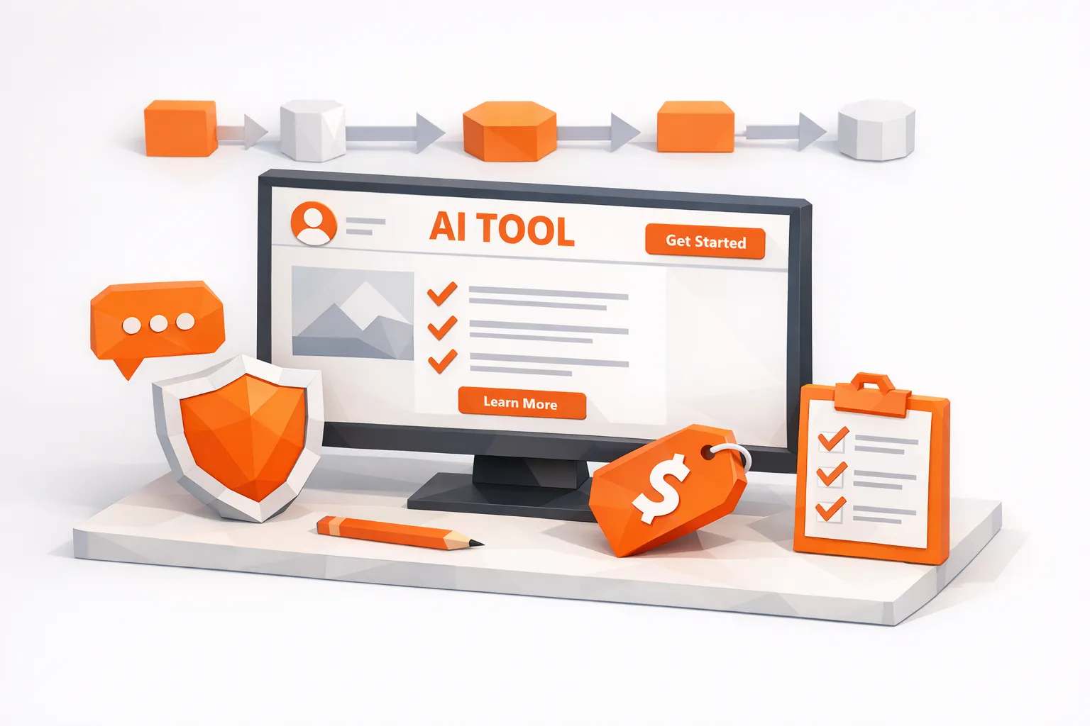
Website for AI Tools: What Great Product Pages Include
Practical checklist to craft high-converting product pages for AI tools—positioning, deliverables, workflow, trust, pricing, and time-to-first-value.
AI tools have a product-page problem in 2026: most visitors arrive curious but skeptical. They have seen “AI-powered” on everything, they worry about data privacy, and they assume your tool is a thin wrapper around a model they already use. A great product page fixes that fast.
If you’re building a website for AI tools, your goal is not to explain AI. It is to make the buyer feel three things within the first minute:
“This is for a situation I recognize.”
“This does the job end to end, not just a demo.”
“I trust what will happen if I connect my data and start using it.”
Below is what high-converting AI tool product pages include, plus the reasoning behind each block so you can apply it to any category (AI agents, writing tools, monitoring tools, developer tools, analytics copilots).
1) A 5-second positioning block (clarity beats clever)
The top of the page should answer, in plain language:
What it does (one job, not five).
Who it’s for (role and context).
The primary outcome (time saved, revenue gained, risk reduced).
The next step (start, try, book, watch).
This is where many AI tool pages fail by leading with vague abstractions like “automate your workflow with AI.” Instead, make your promise testable.
A useful pattern:
Headline: Verb + object + outcome.
Subhead: Where it fits and what it replaces.
Primary CTA: One action.
Secondary CTA: Lower commitment (see examples, watch 90 seconds).
If you want a quick gut-check, apply the “tab test”: if a visitor reads your headline and subhead, then switches tabs, could they accurately describe your product to a coworker?
2) A concrete “what you get” section (not a feature pile)
Features are important, but buyers first want a mental model of the delivered result. Translate your capabilities into deliverables.
Examples of deliverables (adapt to your product):
A ranked list of opportunities (leads, issues, tickets, anomalies).
Draft outputs ready for review (emails, replies, summaries, code).
A workflow that runs on a schedule (daily briefing, alerts, routing).
A single place to see what matters (queue, inbox, tasks).
For each deliverable, add one sentence that ties it to value, not mechanism.
Instead of: “Semantic search + LLM classification.”
Prefer: “Find the threads where people are actively looking for a solution, then route the best ones to a queue to respond.”
3) A “how it works” block that makes the workflow feel real
AI products feel risky when the process is invisible. Your product page should show the workflow in 3 to 5 steps, with crisp verbs.
A high-performing structure:
Input: What you connect or provide.
Processing: What the system detects, scores, or generates.
Control: Where the user approves, edits, or routes.
Output: What gets shipped (alerts, drafts, actions, reports).
Measurement: What gets tracked.
If your tool is set up from a single URL (a strong modern onboarding pattern), say so explicitly and show what the system infers from that URL.
For example, Redditor AI’s positioning (“turn Reddit conversations into customers”) pairs well with an onboarding promise like “paste your URL to start,” because it reduces time-to-first-value and explains why the product can be relevant quickly.
4) Use cases organized by buyer intent, not by your internal modules
Most AI tool pages list capabilities in the order the product was built. Buyers do not think that way. They think in triggers:
“We need more pipeline without hiring.”
“Support is drowning and response quality is slipping.”
“We keep missing buying signals and competitor mentions.”
Create 3 to 6 use cases. For each, include:
Trigger: The situation that causes urgency.
Action: What your tool does.
Result: The measurable outcome.
Proof: A quote, metric, or example artifact.
Micro-CTA: “See an example,” “Try this workflow,” or “Get a template.”
This is also where you can segment by persona (Founder, Growth, Sales, Support) without making the page feel like a consulting brochure.
5) Proof that is specific enough to be trusted
AI skepticism is rational. Great product pages treat proof as a first-class section, not a footer.
Strong proof types:
Short case studies with numbers and context (what changed, over what period).
Before/after snapshots of a workflow (manual vs automated).
Customer quotes that mention the original pain (not just “great product”).
Third-party validation (reputable reviews, press, benchmarks, or credible community mentions).
Avoid anonymous proof (“a leading SaaS company”) unless you genuinely cannot share names. If you must keep it anonymous, compensate with specificity: industry, team size, baseline, and the KPI moved.
If you publish performance claims, make them falsifiable. A good standard is: metric + timeframe + conditions.
6) Trust and risk reduction, written for operators
For a website for AI tools, trust content is not only about security badges. It is about answering operational questions:
What data do you ingest?
Where is it stored?
Who can see it?
What is retained, and for how long?
What controls exist (permissions, review steps, rate limits, safeguards)?
If you have formal documentation (SOC 2, ISO 27001, pen test summaries, DPA, security page), link it. If you do not, you can still explain your approach clearly without overpromising.
Helpful references to align your language and coverage:
NIST AI Risk Management Framework for risk categories and governance vocabulary.
OWASP Top 10 for LLM Applications for common LLM failure modes buyers worry about.
Keep this section plain and scannable. The goal is not to “sound secure,” it is to remove deployment friction.
7) Pricing that matches how buyers evaluate AI (avoid ambiguity)
Pricing is where many AI tools lose qualified visitors. If your pricing depends on usage, define the unit clearly.
Common AI pricing units include:
Seats
Credits
Tasks (units of work)
Runs (automations)
Data volume (records, pages, threads)
What great product pages include:
A simple tier table with the primary constraint per tier.
A sentence explaining what drives cost (so buyers can estimate).
The upgrade path (when you need the next tier).
If you have an enterprise plan, what it adds (SSO, governance, SLAs), only if true.
If you cannot publish prices, reduce uncertainty with at least one anchor: a starting price, a typical range, or a “talk to us if you’re above X volume.”
8) A conversion path designed for “I want to see it” behavior
AI tools are demo-driven, even when they are product-led. Your product page should support multiple readiness levels without fragmenting attention.
A clean conversion architecture:
Primary CTA: start trial, start free, or book demo.
Secondary CTA: watch a short demo, view examples, or paste a URL to generate a preview.
Repeated CTAs: after proof, after use cases, and near pricing.
A mistake to avoid: offering four CTAs above the fold (demo, trial, contact, newsletter). Pick one.
9) Comparison content that acknowledges tradeoffs
In saturated AI categories, buyers are comparing you against:
A general LLM (ChatGPT, Claude, etc.).
A spreadsheet and a human process.
A cheaper point solution.
Address that directly with an honest comparison section. Even a small table helps buyers self-qualify.
| Comparison | When it’s enough | When your tool wins |
|---|---|---|
| General LLM | One-off tasks, low stakes, manual copy/paste | Always-on monitoring, routing, repeatable workflows, attribution |
| Manual process | Low volume, plenty of time, no SLA | High frequency, need coverage, need fast response, need consistency |
| Cheaper tool | Single feature, no workflow integration | End-to-end outcome, fewer tools, measurable ROI |
The point is not to attack competitors. It is to show you understand the buyer’s real alternatives.
10) Time-to-first-value: show the first 15 minutes
Great product pages remove the fear of setup. Add a short section that answers:
What do I need before I start?
What will I have by the end of the first session?
What is the smallest successful outcome?
For automation tools, “URL-based setup” is especially effective because it gives users a fast path to relevance without a long configuration phase.
If your tool integrates with common stacks (CRM, Slack, email, webhooks), list them only if they exist and link to your docs or integration page.
11) Product page SEO for AI tools (so the page can actually be found)
A product page is not just for paid traffic. It should also rank for high-intent queries. For AI tools, that often means “AI for X” and “X automation” queries.
Focus on:
One primary keyword theme per page (avoid trying to rank for everything on the homepage).
Use-case landing pages for distinct intents (example: “AI Reddit monitoring,” “AI lead scoring,” “AI support triage”).
Internal links from blog posts to the relevant product destination page.
Clean technical basics (indexable, fast, structured headings).
For implementation guidance, Google’s documentation is the least controversial reference point:
Also consider adding relevant schema (Organization, SoftwareApplication) when accurate, and avoid marking up reviews you cannot substantiate.
12) Measurement: tell buyers you take outcomes seriously
AI fatigue is partly caused by vague ROI. A strong product page hints at how success is measured.
If applicable, include a short “What we track” block, such as:
Time-to-signal (how fast you surface relevant items)
Precision (how often alerts are truly relevant)
Time-to-first-response
Clicks, signups, demos, or revenue attributed to the workflow
This kind of instrumentation language is persuasive to operators because it signals maturity. It also filters out bad-fit leads.
A practical checklist for a high-converting AI tool product page
Use this as a final QA pass before you ship:
| Section | Must answer | Common failure |
|---|---|---|
| Above the fold | What, for who, outcome, next step | Vague “AI-powered” messaging |
| What you get | Deliverables buyers recognize | Feature list without value |
| How it works | Inputs, controls, outputs | Magic box, unclear workflow |
| Use cases | Triggers, results, proof | Too many, too generic |
| Proof | Specific outcomes, context | Empty testimonials |
| Trust | Data handling, controls | Badges without substance |
| Pricing | Unit, tiers, upgrade path | Hidden constraints |
| Conversion path | One primary CTA | Too many CTAs |
| Comparison | Alternatives and tradeoffs | Pretending you have no competitors |
| Time-to-value | First 15 minutes | Setup anxiety left unanswered |
| SEO basics | Match intent, indexable | Homepage tries to rank for all queries |
| Measurement | How success is tracked | No ROI language |
If your AI tool wins through conversations, your product page should reflect that
Many AI products, especially in growth and customer acquisition, rely on the same loop: detect intent, act with context, and measure outcomes. If that describes your motion, your product page should make the loop obvious.
Redditor AI is a good example of a narrow, outcome-first positioning: it uses AI-driven Reddit monitoring and automatic brand promotion to help turn Reddit conversations into customers. If you want to see how a conversation-driven acquisition tool is presented, start at the homepage and evaluate it against the checklist above: Redditor AI.

Thomas Sobrecases is the Co-Founder of Redditor AI. He's spent the last 1.5 years mastering Reddit as a growth channel, helping brands scale to six figures through strategic community engagement.